Most bad color grading doesn’t look bad at first.
That’s the dangerous part.
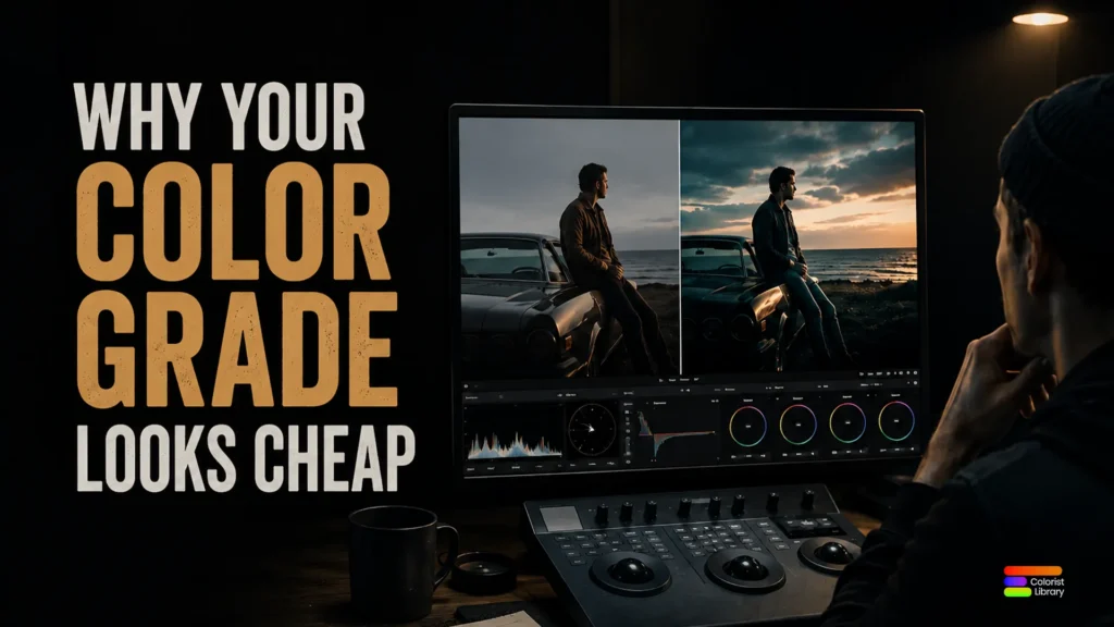
You add contrast. Push saturation a little. Throw on a cinematic LUT. The screenshot looks dramatic enough to survive Instagram compression and suddenly the brain goes:
“yeah… cinema.”
Then the footage moves.
Skin tones turn radioactive. Highlights snap apart. Shadows lose air. Everything starts feeling strangely digital, even with film emulation LUTs stacked on top.
This is where most cinematic color grading falls apart.
Not because the camera is bad.
Not because you need another LUT pack.
Because the image is fighting itself.
Most Cinematic LUTs Push Too Hard
At Colorist Library, we kept noticing the same thing while grading digital footage in DaVinci Resolve and Premiere Pro:
cheap-looking grades usually come from forcing the image instead of shaping it.
Real cinematic color grading is quieter than people think.
The best film looks rarely scream for attention. Contrast has restraint. Colors separate naturally. Highlights soften instead of exploding across the frame.
That’s why motion picture film still feels different from digital.
Why Film Emulation Still Matters
Film absorbs light differently.
Digital footage, especially from modern mirrorless cameras, captures everything with almost clinical precision. Which is exactly why filmmakers keep searching for:
- free cinematic LUTs
- film emulation LUTs
- cinematic color grading
- DaVinci Resolve LUT packs
- Premiere Pro cinematic LUTs
- free color grading LUTs
Everyone is chasing the same thing:
footage that feels expensive.
But expensive-looking images usually come from subtraction, not addition.
The shadows breathe more.
The tonal response softens.
Skin tones stop looking processed.
That’s where good film LUTs help.
Not as filters.
As translators.
The Problem With Most “Cinematic” Grades
Most cinematic LUT packs online don’t understand restraint.
Everything becomes:
- crushed blacks
- teal shadows
- orange skin
- hyper-sharpened contrast
- saturation fighting for survival
The image turns into visual caffeine.
Modern cinema usually looks softer than YouTube thinks it does.
Even strong narrative grades preserve texture, dimensionality, and natural highlight rolloff. The image still feels lived in.
That invisible feeling is usually the difference between:
“nice LUT”
and
“this actually feels like a film.”
What Actually Makes Footage Feel Cinematic
A strong cinematic LUT should shape:
- tonal response
- highlight rolloff
- color density
- contrast behavior
- atmosphere
Without making the audience notice the grade itself.
That’s the philosophy behind Colorist Library.
Whether it’s free color grading LUTs, film emulation workflows, or cinematic LUT packs built for filmmakers, the goal stays the same:
make the footage feel something before it tries to impress anyone.
Because good color grading usually whispers.
The loud stuff rarely survives the second look.